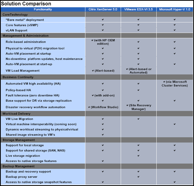
New Hypervisor Feature Comparison Chart by Citrix

Not sure what to make of it (Except that an ESX4 vs.. XenServer 5 chart will look DRAMATICALLY different). I do also disagree with the ‘Shared image streaming to VM’s’ comparison. Citrix’s Provision Server (great product) can stream to both XenServer, Hyper-V and VMware Virtual Machines.
In the spirit of democracy, how do you interpret this chart?
Let me know in the comments..

