Pimping out the Citrix Netscaler – 2.0
As originally published on vCloudInfo.com, the TechDev team at IPM has beefed up the NavUI of the Netscaler to provide additional useful information for users. Up until now, however, you were still stuck with the same 3-panel frame as provided out of the box: 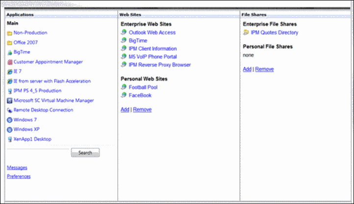
Well, Marcos Velez of the IPM TechDev team has done it again, with a totally revamped UI, based on the Web Interface 5.4 Symphony Theme: 
Once you log on, however, you soon come to realize that the similarity ends there!
Check out the sleek new look for XenApp applications …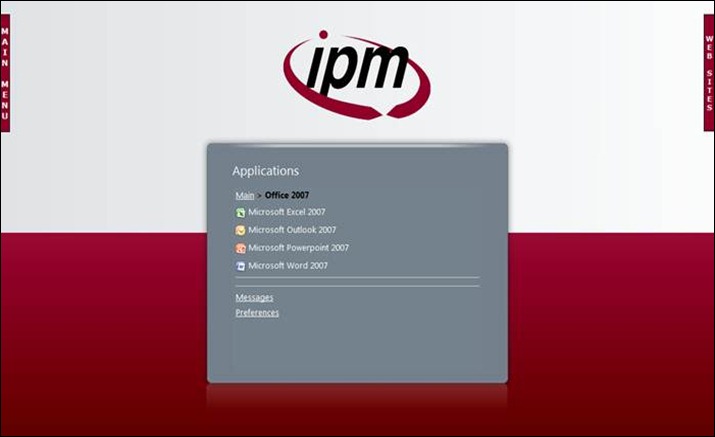
… as well as the preference menu …
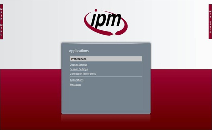
… and detail screens:
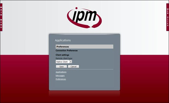
“But how do I access corporate as well as personal web sites and other links,” you ask?
Why through fly-away menus, of course!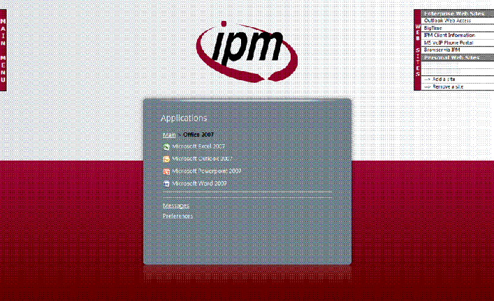
The TechDev group also specializes in integrating Web Interface with other standard (e.g. OWA), custom, and corporate web apps: 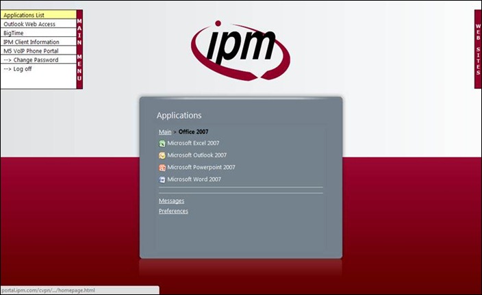
Even the logoff screen has been given a nice facelift, automatically redirecting users back to the login page: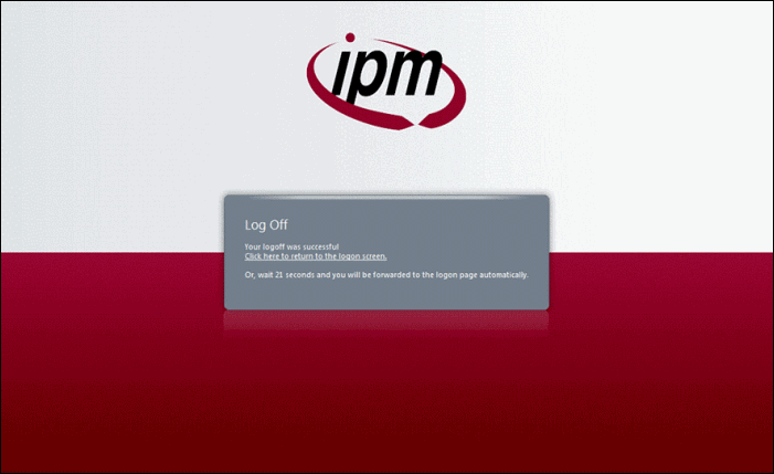
Sure this post might be a little SALESey, but these are some pretty kick ass enhancements. ![]()

