Lovelace is now standard! I don’t care.
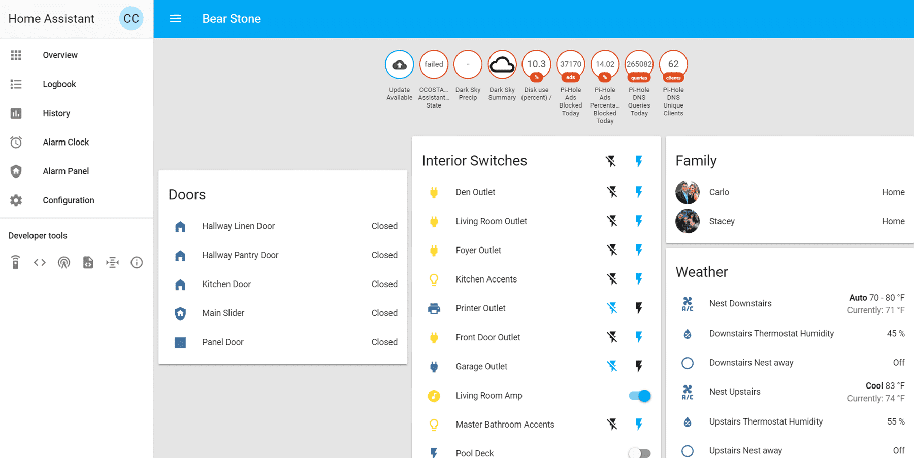
It is not that I don’t care at all. I really think it is an amazing enhancement to Home Assistant. I honestly am looking forward to implementing it but it is not that high on my list. In fact, I have about 100 other things that I think would add more value to my Smart Home than #Lovelace. It has been in beta development for about 8 months. Each month, I have seen more and more cards come out and I’ve added them to my GitHub list but just never got around to actually implementing it. Now with the 0.86 release, Lovelace is the default User Interface for the program. AND my UI looks horrible ; Exhibit A.
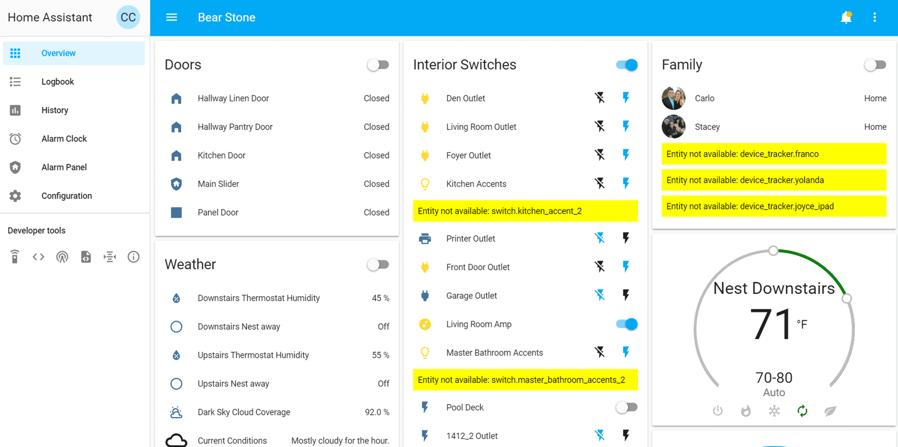
Now even with the new Lovelace interface, it’s a LITTLE better but still pretty trash looking; Exhibit B.
This is definitely completely and solely my fault. I have had all the time and the knowledge necessary to build something beautiful. And I will. Eventually. But for now, I just don’t need it. My house is a voice driven home. With about 8 echo devices scattered around the house, ‘she’ is always in ear shot and we can control almost every light in the house just by saying a few words. Contrast that with taking out a phone and pulling up an interface and it really seems silly to spend a lot of time focusing on the UI for my family.
No one will use it.
The way I have been building my Smart Home has been with two main ideas.
1) Automation should just happen. The house should be programmed in a way that things happen as they should. Lights turn on and off in response to sensors, time and situations in the house. Automagically. Without constant user input.
2) Voice should be used for those situations where you need an exception or automation override.
Because of these two mindsets, the User Interface really went to the back burner.
Of course, there is one exception.
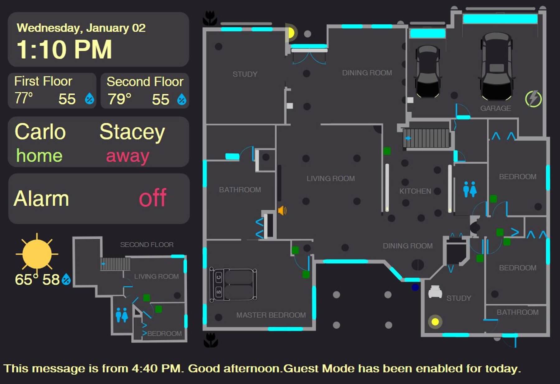
FloorPlan. I have put in the effort and time to build an incredibly useful Home Assistant screen that I use on a daily basis to consume information quickly. When we want to see if all the doors and windows are closed for the night or double-check if the alarm is set correctly, we take a look at our tablets running Floorplan. They are hanging on the wall in the bedroom and in the hallway. Spots where you want to just quickly see the information, process it and then head to bed or out the door. That is the use case for my FloorPlan implementation. I never interact with it even though it totally has the ability to control lights and devices.
My use case for Lovelace will be mobile. I think this method will allow me to build efficient interfaces for my mobile phone that I can use when I am not in the house. When I need to quickly see the status of the house and maybe turn off a few lights or a garage door (garadget) that wasn’t taken care of via automations, I think Lovelace will be the answer. Specifically, I think I will be using Glance cards with filtering to dynamically bubble up the relevant information. Viewing surveillance cameras via lovelace will be another amazing use case.
So right now, my UI SUCKS but I’m ok with it. If you have gotten this far down the page and want to hear my additional thoughts on the subject, check out the video below!
Consider subscribing using the email form below and Happy Automating!


